Demi Petcha Kucha
Posted: May 15, 2014 Filed under: Subject Leave a commentTomorrow I have to present my petcha kucha. I’m really quite nervous as i’m not very good with presentations but I’m really happy with my project so it might be quite fun presenting my ideas and work.
Here is my presentation…..
Digital Project Summary
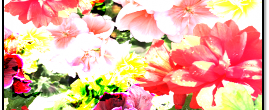
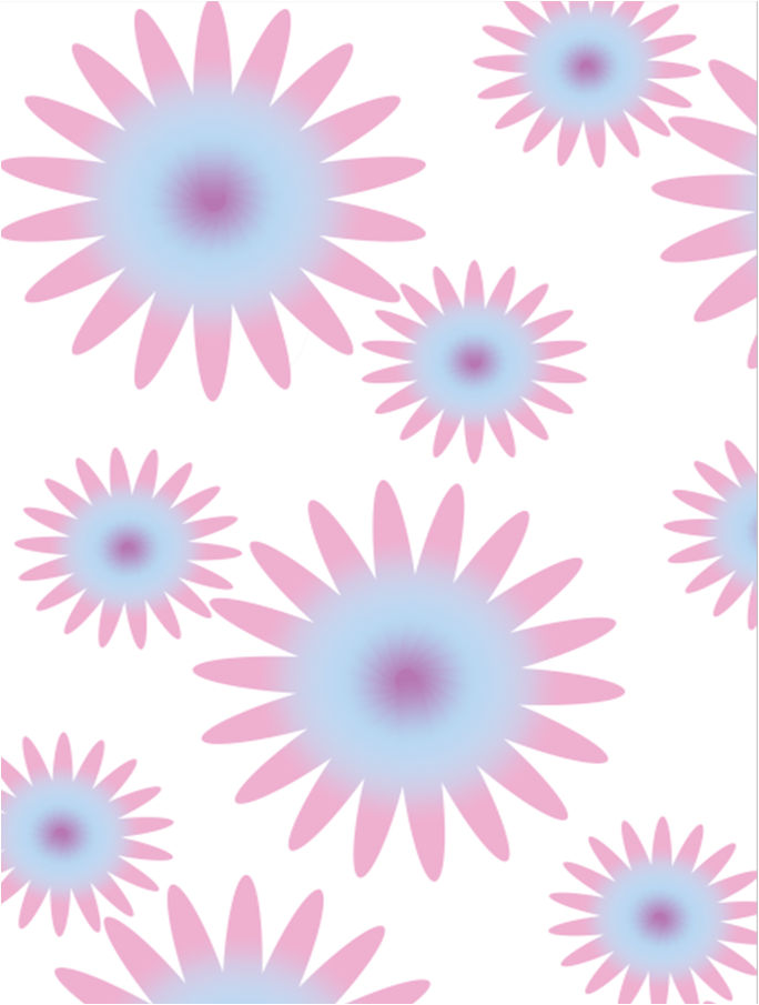
Posted: May 15, 2014 Filed under: Subject | Tags: floral, Photoshop, Subject, Textiles, University Leave a commentFor the past 3 weeks I have been attending Steve’s workshops that have been teaching us how to use photoshop and illustrator. These lessons have been really helpful as I haven’t really used either of them before and I have learnt a lot over the past 3 weeks that has been awesome as we had to come up with 5 digital floral designs using the techniques we have learnt, and I think I’ve come out with some really good designs for my first attempt on photoshop and illustrator.
The theme for the module was floral and life drawing, unfortunately I haven’t been able to make the life drawings due to personal reasons but I think I would have enjoyed the lessons if I was able to attend. As I knew it was a floral module before I went back to uni I decided to go out and take quite a few photos of some really beautiful flowers. Working with these images has been so much fun as I have created some lovely floral designs using some of them. I also used 3 drawings from term one of my botanical drawings because I was quite happy with them. I decided to go with quite a bright theme that is targeted at young woman who are very feminine, and I think the designs would be perfect for interior. I looked at different artist and designers such as Laura Ashley also I have looked at a lot of botanical designs and drawings. Steve told us about a few websites that would really help with research such as Bowie Styles.
I am quite happy with my final 5 designs they have turned out better than I thought they would. I used the images I had taken and the drawings I produced in the first term to create my designs. I do with that maybe I used illustrator at least for one of my designs but I got on a lot better with photoshop and wanted to produce the best I could so thought it would be better to stick with photoshop.
These are my 5 finals designs. Hope you like……
Unfortunately it wont let me post the actual images up so here is the power point they are on.
Mood Board
Posted: May 15, 2014 Filed under: Subject | Tags: floral, Mood boards, Swatches Leave a commentI have never created a mood board before but after being told its just a board full of potential ideas and colour swatches I thought it was quite easy to do
I found a lot of photos and colours related to the designs I had created which was fantastic!

09/05/14 – Illustrator
Posted: May 12, 2014 Filed under: Subject Leave a commentUnfortunately I wasn’t in on Friday due to personal reasons but my friend has sent me her notes so we can all see what I missed so I don’t fall behind…..

06/05/14 – Illustrator and photoshop
Posted: May 12, 2014 Filed under: Subject Leave a commentToday we started with learning how to draw in Illustrator
We have to design a Christmas card, so we all decided to make a snowman
We had previously learnt how to use the shapes so Steve taught us how to use the gradient tool
Gradient- a colour that gradients into a different colour
Click the Gradient tool
*Click on the gradient box to choose colours we want
*draw a line in the shape to the desired direction you want the gradient going
this is what I designed
I was really quite chuffed with this piece!!!!
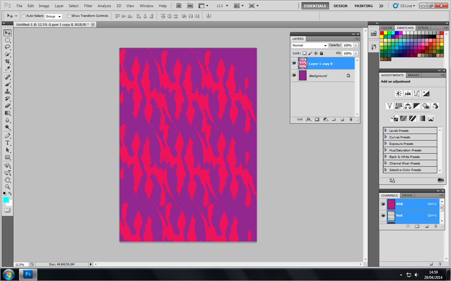
We then went back onto photoshop and Steve taught us one way of making flowers using shapes.

02/05/14- Illustrator
Posted: May 12, 2014 Filed under: Subject Leave a commentToday we were using illustrator, which was really cool because I’ve never used it before!!!!
Illustrator is a vector programme – Big images with out pixelating because it is done mathematically.
*Using rectangle tool to create a shape
*Selection arrow to put colour in the shape, then click on a colour in the palette.
*Make a patter using the different tools
*To group – click object then click group
*To put my pattern into the colour palette click on the pattern then click edit and the define pattern.
*To line us a patter click view and the show grid
*When creating a star you can add more points by double clicking and a page will appear for you to be able to change
Images of my work


Tuesday April 29th
Posted: May 12, 2014 Filed under: Subject Leave a commentToday was our first day using photoshop.
I learnt that RGB stood for red, green and blue
For new- Ctrl N
making sure you always use international paper
Size A3/4 to go with University printers
Resolution- 300 pixels/inch…… You want the resolution to look crisp and not blur together
Layers!!! This makes photoshop brilliant!!! you can delete and create new layers, hide them and change them around also you can overlay layers……. I love it!!! you can also merge layers to create patterns easily.
To make anything smaller or bigger click Ctrl T and a box will appear about the image. If you hold down shift key and move image to the desired size it will keep the image in scale…..
This basically sums up the first lesson, it was a little slow because we were doing the basics but I learnt a lot……
Here are some images I produced


Term 3!! Material Matters ‘Digital Project’ 28/04/14
Posted: May 12, 2014 Filed under: Subject Leave a commentWow last term of my first year already, how the time flies when your having fun aye!!!
This term is about introducing us into the digital side of textiles e.g. photoshop, illustrator, digital print, laser cutting etc….
Today we had our brief for the term. I was a little concerned about this project because we only had 3 weeks to complete the work but also I wasn’t quite sure what they wanted from us.
Im sure it will be explained in more detail throughout the week.
PDP – REFLECTION ON CONSTELLATION!!!
Posted: May 12, 2014 Filed under: Constellation Leave a commentWhen I started University I didn’t know there was a constellation section to the course and wasn’t quite sure how it was going to fit in with the course I am on. I couldn’t understand why we were learning about things that weren’t relevant to my chosen area. After a few sessions I understood a little better why we were learning these different topics but some of the topics I still don’t find relevant to textiles. The topics I think were interesting could definitely help me in the future when writing about my work in an academic way or evaluating and analysing my own work and possibly others.
My favourite lecture for the first term was Cath’s lecture ‘Teenage Kicks – Cultural approaches to Dr. Martens boots.’ This lecture was really interesting to me personally because I’m very keen on fashion and Dr. Martens are one of my favourite pieces of clothing that I own. This session was also interesting to me as I do love fashion but I’ve never really thought about the meaning behind a certain style or piece of clothing. The lecture taught us that Dr. Martens were originally designed for work wear, aiming their product at policemen and OAP’s. The target was to advertise the Dr. Martens as comfortable and sturdy not as a fashionable item. From there then we went on to look at how the younger generation from different groups and scenes adopted the brand and claimed it as their own, which changed the original purpose into a fashionable item which isn’t what it was designed for. From then on the Dr. Martens had a different meaning depending on the group that had adopted the shoes e.g. in the 1960’s they were adopted by the skinheads and mods, in the 1970’s the punks claimed them and the in the 1980’s the Goths.
I found Cath’s lecture so interesting that I chose her option for constellation in the second term. The option Cath was teaching was called ‘Smells like teen spirit; subcultures and street style.’ As I said previously I love fashion but never really thought about the meanings behind that style and I thought this would be a great opportunity to learn about subcultures and how they are created. We were told that we were going to be looking at different subcultures such as The Teds, The Zoot suit and Punks. We were given a images of each subculture then given a academic case study on the subculture to, this made learning about the specific subculture a lot easier and a lot more interesting than just reading some information and that’s it, I l liked having visual. Cath then made it easier to evaluate the different images we were given. We were taught a specific way to evaluate and analyse different pieces of work, the strategy we learnt was to split our information into three columns; Describe the characteristics of the image, Analysis of the meanings/connotations and Theoretical underpinning/Academic studies. This table made evaluating each case study so much easier and also at the end of the term we have to write an essay that is based on two or more images and we have to describe and analyse and I think this table is going to help me a lot more now, especially when I have never been very strong at analysing work or at academic writing.
As I said previously I have to write a essay about my desired topic, I have chosen to look at the Teddy Boy suits and the differences you can see through the decades. This essay was inspired by one of Cath’s lectures on the Teddy boys and I found the case study and subculture so interesting that I wanted to find out more. So far I have really enjoyed researching different case studies that have been written about the Teddy boy subculture but I have also enjoyed writing the essay! This for me is a big deal because I hate essays but this one has really caught my attention and I have really enjoyed writing the essay.
I have found Cath’s sessions very helpful towards my textiles course when it comes to describing and analysing not only artists work but my own work too. I have found the term to be very interesting and beneficial and I’m really glad I chose this option for this term.

Recent Comments